What anime proportions actually are (and why they’re not random)
Anime proportions are simplified versions of real human anatomy, built on consistent internal rules—not guesswork.
At its core, proportion is just how big one part of the body is compared to another. Anime pushes and stylizes those relationships—but it doesn’t abandon them.
At first glance, anime can feel all over the place. Big eyes, tiny noses, stretched legs—it looks inconsistent. But if you look closer, you’ll notice something important: each character follows its own internal logic.
- The head relates to the body in a consistent way
- Joints land in predictable positions
- Facial features follow spacing rules—even when exaggerated
That’s why two stylized drawings can feel completely different—one looks “right,” the other doesn’t.
Good anime proportions aren’t about realism—they’re about consistency you can rely on.
If there’s one idea to hold onto, it’s this: you don’t need perfect anatomy—you need a system.
Stylization vs structure (the balance beginners miss)
Anime simplifies shapes, but it doesn’t remove structure.
Stylization only works when there’s something solid underneath. Skip that, and the drawing stops looking stylized—it just feels unstable.
For example:
- You can make the eyes bigger—but they still need to align correctly
- You can shorten the torso—but joints still have to connect naturally
- You can lengthen legs—but balance still needs to make sense
A good way to think about it: anime is like a filtered version of reality. The filter changes proportions, but the underlying structure stays intact.
If your drawings feel off, it’s rarely because your style isn’t “anime enough.” More often, the structure underneath isn’t consistent yet.
The standard anime proportion system (heads + body framework)
Most anime characters fall between 6–8 heads tall, with 6–7 heads being the most reliable starting point.
The “heads tall” system is a simple way to keep proportions consistent. You use the height of the head as a unit and stack it down the body.
So “7 heads tall” just means:
- The full height of the character equals about 7 head lengths
This gives you a flexible measuring system that works across poses and characters.
Here’s the core idea:
- Fewer heads = shorter, cuter proportions
- More heads = taller, more realistic proportions
To visualize it, try adjusting the scale:
Why 6–7 heads is the best starting point
Because it balances simplicity and believability.
Go too short (4–5 heads), and the character leans chibi. Go too tall (8 heads), and it becomes harder to manage consistently.
6–7 heads gives you:
- Enough realism to feel grounded
- Enough simplicity to stay manageable
- Flexibility across most anime styles
That’s why beginner-focused systems—including lessons on Dattebayo—often start here.
What 6 vs 8 heads actually looks like (visual difference)
It’s not just height—it’s personality.
- 6 heads tall: softer, more approachable, slightly youthful
- 7 heads tall: balanced, classic anime protagonist feel
- 8 heads tall: taller, sharper, more dramatic
You’re not just picking proportions—you’re shaping how the character feels.
The anime proportion cheat sheet (where everything goes)
Anime proportions become much easier when you anchor key body parts to consistent landmarks.
Instead of trying to measure everything precisely, you rely on repeatable checkpoints.
For a 6–7 head character:
- Chin to chest: ~1 head
- Chest to navel: ~1 head
- Elbows: around the 3-head mark
- Waist: around 3 heads
- Knees: around 5–6 heads
- Hands: mid-thigh area
These aren’t strict rules—they’re anchors. What matters is consistency.
Why landmarks matter more than perfect ratios
Because they still work when the pose changes.
Exact measurements fall apart once you rotate or foreshorten a figure. Landmarks don’t.
- Elbows stay tied to the torso
- Knees still divide the leg predictably
- Hands still fall near mid-thigh
That’s why experienced artists don’t measure every time—they recognize patterns.
Anime vs real anatomy (what changes—and what doesn’t)
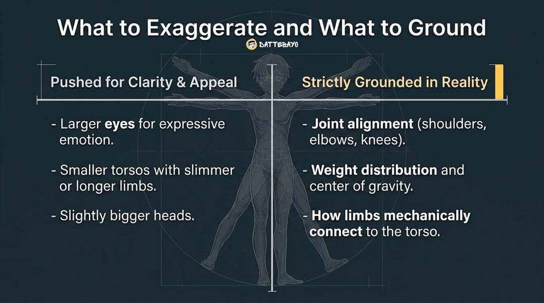
Anime exaggerates proportions, but keeps core structure—especially joints and balance—close to reality.
Compare a real person to an anime character and you’ll notice:
- Longer legs
- Smaller torsos
- Larger eyes
But underneath that:
- Joints still connect the same way
- Weight still needs to balance
- The body still follows physical logic
What gets simplified or exaggerated
Anime adjusts proportions to improve clarity and appeal.
Common choices:
- Larger eyes for expression
- Slightly bigger heads
- Slimmer or longer limbs
These exaggerations make characters easier to read—especially on smaller screens, which matters even more in today’s mobile-first viewing habits.
What you shouldn’t break
Structure isn’t optional.
If these go wrong, the drawing immediately feels off:
- Joint alignment (shoulders, elbows, knees)
- Balance and center of gravity
- How limbs connect to the body
You can push proportions—but you can’t ignore how bodies function.
Why your proportions look “off” (and how to spot the problem fast)
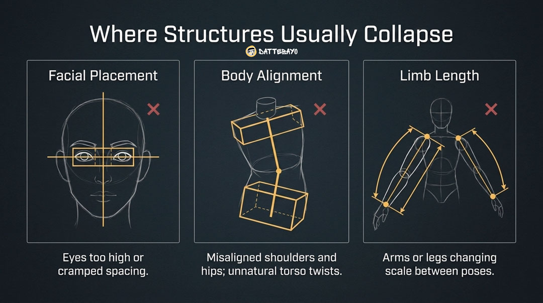
Most proportion issues come from placement errors—not overall ratios.
A character can be perfectly “7 heads tall” and still look wrong if something is misplaced.
The 3 most common mistake groups
1. Facial placement issues
- Eyes too high or too close together
- Features drifting off-center
2. Body alignment problems
- Shoulders and hips misaligned
- Torso twisting in unnatural ways
3. Limb length inconsistency
- Arms changing length between poses
- Legs not matching the body scale
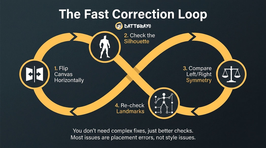
A quick self-check method (fast correction loop)
You don’t need complex fixes—just better checks.
- Flip your canvas horizontally
- Zoom out and check the silhouette
- Compare left/right symmetry
- Re-check landmarks (elbows, knees, waist)
If something feels off, it usually is—and it’s usually a placement issue, not a style issue.
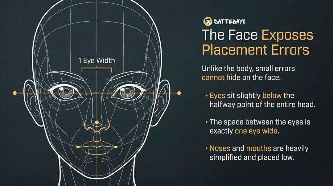
Face proportions in anime (the part most people get wrong)
Anime faces follow consistent spacing rules—even when heavily stylized.
This is where small mistakes stand out the most.
Basic anime face layout
- Eyes sit slightly below the halfway point of the head
- Space between the eyes ≈ one eye width
- Nose and mouth are simplified and placed lower
If you’ve looked at structured lessons like anime face drawing basics, you’ve probably noticed the focus is on spacing—not detail.
Why small shifts break the whole face
Because faces are extremely sensitive to proportion.
Move the eyes slightly too high, and the character looks off.
Place them too close together, and the face feels cramped.
Unlike the body, where small errors can hide, the face exposes everything.
How to keep proportions consistent across poses and angles
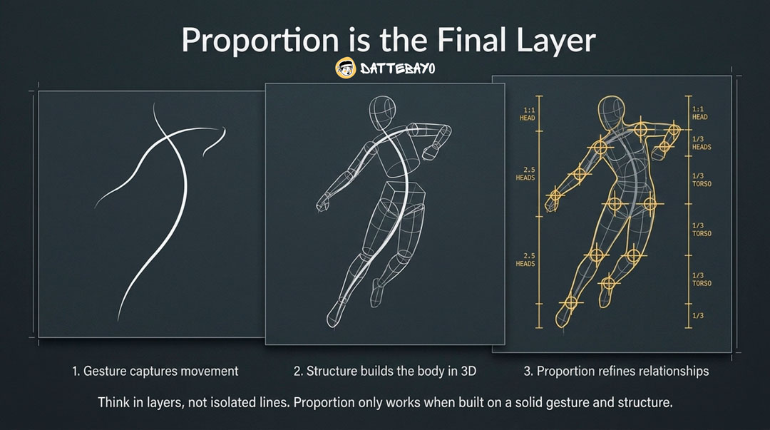
Consistency comes from combining gesture, structure, and proportion landmarks—not memorizing a single pose.
If your proportions fall apart when the pose changes, it usually means you memorized shapes instead of understanding relationships.
The “gesture → structure → proportion” approach
Think in layers, not isolated lines.
- Gesture captures movement
- Structure builds the body in 3D
- Proportion refines relationships using landmarks
This isn’t about rigid steps—it’s about priorities. Proportion works best when it’s built on top of something solid.
If you want a clearer progression for this, platforms like Dattebayo organize these ideas so you’re not piecing them together randomly.
Why copying one pose doesn’t build consistency
Because it doesn’t teach adaptability.
You might get one drawing right—but:
- Change the angle → proportions break
- Change the pose → limbs stop making sense
Consistency comes from understanding the system, not memorizing results.
How to choose proportions for your style (not just follow rules)
Proportions aren’t just technical—they’re a design choice.
Once you understand the system, you can start adjusting it intentionally.
Chibi, standard, and semi-realistic proportions
- 2–4 heads: chibi, cute, exaggerated
- 6–7 heads: standard anime
- 7–8 heads: more realistic or dramatic
Each range creates a different impression.
Using proportions to communicate character type
Proportions are part of storytelling.
- Shorter proportions → youthful, friendly
- Taller proportions → confident, serious
- Longer legs → elegance or power
- Larger head → cuteness or vulnerability
You’re not just building a body—you’re shaping how the character feels.
How to practice anime proportions (without copying blindly)
Use a simple loop: observe → simplify → redraw → vary.
This is where understanding starts to stick.
A simple practice loop that works
- Observe a reference (don’t just copy it)
- Simplify it into head units and landmarks
- Redraw from memory
- Change the pose or angle
This pushes you to understand proportions instead of tracing them.
How to build consistency faster
Repetition helps—but structured repetition helps more.
- Draw the same character multiple times
- Keep proportions consistent using landmarks
- Compare versions and spot differences
If you want more guidance, Dattebayo focuses on this exact idea—helping you build consistency, not just finish drawings.
FAQ: Anime proportions
How many heads tall should an anime character be?
6–7 heads is the most beginner-friendly range, with flexibility depending on style.
Where should elbows and knees fall in anime proportions?
Elbows are around 3 heads down, knees around 5–6 heads.
Why do my anime legs look too long or too short?
Usually a landmark issue—knees placed too high or low, or inconsistent head scaling.
How do I keep proportions consistent across different poses?
Use landmarks and a gesture-first approach instead of copying a single pose.
What’s the difference between 6-head and 8-head characters visually?
6-head looks shorter and cuter; 8-head looks taller and more realistic.
Why do my anime faces look off even when I follow guides?
Small placement errors—especially eye height and spacing—have a big visual impact.
Do anime proportions change depending on style?
Yes. Different styles intentionally use different ratios.
What’s the fastest way to improve anime proportions?
Structured repetition (observe → simplify → redraw → vary). Guided learning from platforms like Dattebayo can help you stay consistent and improve faster.
If your drawings have been feeling “off,” it usually comes down to unclear proportions—not a lack of ability. Once you start seeing characters as systems of relationships instead of random shapes, things begin to click.